
Key points
– Successful investing can be really difficult in times like now with immense uncertainty around inflation, interest rates, issues in global banks and recession risks impacting the outlook for investment markets.
– This makes it all the more important to stay focussed on the basic principles of successful investing.
– These five charts focus on critical aspects of investing that are insightful in times of market stress: the power of compound interest; don’t get blown off by cyclical swings; the roller coaster of investor emotion; the wall of worry; & market timing is hard.
Introduction
Every so often the degree of uncertainty around investment markets surges and that’s been the case for more than a year now reflecting the combination of high inflation, rapid interest rate hikes, the high and rising risk of recession which has been added to in the last few weeks by problems in US and European banks. And all of this has been against the background of increased geopolitical uncertainties. Falls in the value of share markets and other investments can be stressful as no one wants to see their wealth decline. And so when uncertainty is high a natural inclination is to retreat to perceived safety. As always, turmoil around investment markets is being met with much prognostication, some of which is enlightening but much is just noise. I will be the first to admit that my crystal ball is even hazier than normal in times like the present. As the US economist JK Galbraith once said “there are two types of economists – those that don’t know and those that don’t know they don’t know.” And this is certainly an environment where we need to be humble.
But while history does not repeat as each cycle is different, it does rhyme, in that each cycle has many common characteristics. So, while each cycle is different the basic principles of investing still apply. This note revisits once again five charts I find particularly useful in times of economic and investment market stress.
Chart #1 The power of compound interest
This is my favourite chart. It shows the value of $1 invested in various Australian assets in 1900 allowing for the reinvestment of dividends and interest along the way. That $1 would have grown to $246 if invested in cash, to $997 if invested in bonds and to $781,048 if invested in shares up until the end of February. While the average return since 1900 is only double that in shares relative to bonds, the huge difference between the two at the end owes to the impact of compounding – or earning returns on top of returns. So, any interest or return earned in one period is added to the original investment so that it all earns a return in the next period. And so on. I only have Australian residential property data back to 1926 but out of interest it shows (on average!) similar long term compounded returns to shares.
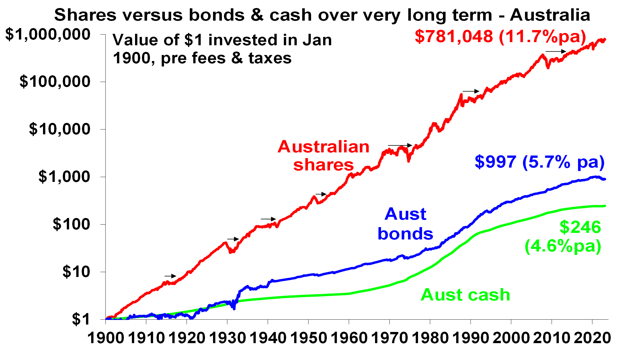
Source: Bloomberg, AMP
Key message: to grow our wealth, we must have exposure to growth assets like shares and property. While shares and property have had a rough ride over the last year as interest rates surged, history shows that both will likely do well over the long-term.
Chart #2 Don’t get blown off by cyclical swings
The trouble is that shares can have lots of (often severe) setbacks along the way as is evident during the periods highlighted by the arrows on the previous chart. Even annual returns in the share market are highly volatile, but longer-term returns tend to be solid and relatively smooth, as can be seen in the next chart. Since 1900, for Australian shares roughly two years out of ten have had negative returns but there are no negative returns over rolling 20-year periods.
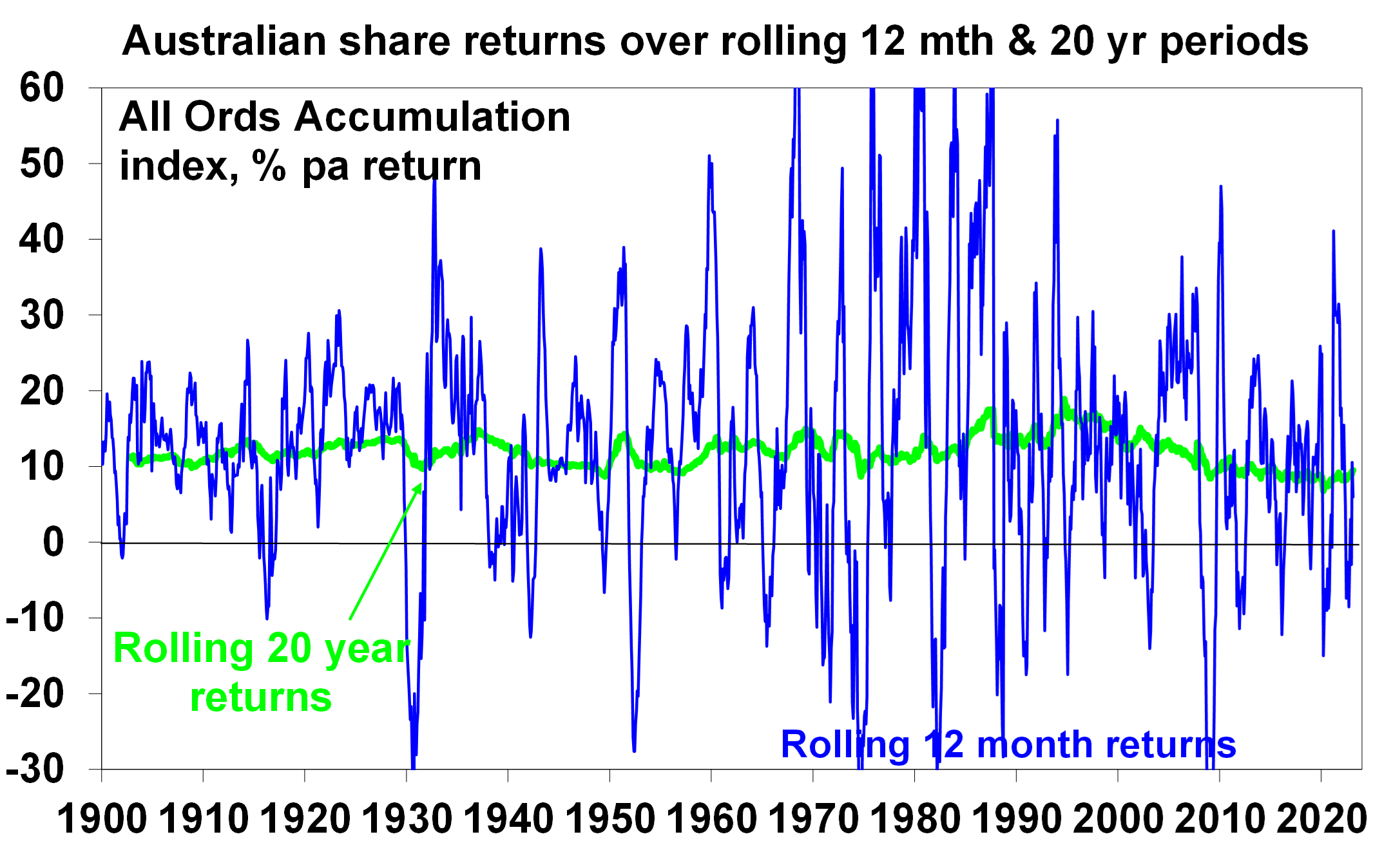
Source: Bloomberg, AMP
The higher returns that shares produce over time relative to cash and bonds is compensation for the periodic setbacks they have. But understanding that these periodic setbacks are just an inevitable part of investing is important in being able to stay the course and get the benefit of the higher long-term returns shares and other growth assets provide over time.
Key message: short-term, sometimes violent swings in share markets are a fact of life but the longer the time horizon, the greater the chance your investments will meet their goals. So, in investing, time is on your side and it’s best to invest for the long-term when you can.
Chart #3 The roller coaster of investor emotion
It’s well known that the swings in investment markets are more than can be justified by moves in investment fundamentals alone – like profits, dividends, rents and interest rates. This is because investor emotion plays a huge part. This has been more than evident over the last year with all the swings in markets. The next chart shows the roller coaster that investor emotion traces through the course of an investment cycle. Once a cycle turns down in a bear market, euphoria gives way to anxiety, denial, capitulation and ultimately depression at which point the asset class is under loved and undervalued and everyone who is going to sell has – and it becomes vulnerable to good (or less bad) news. This is the point of maximum opportunity. Once the cycle turns up again, depression gives way to hope and optimism before eventually seeing euphoria again.
The roller coaster of investor emotion
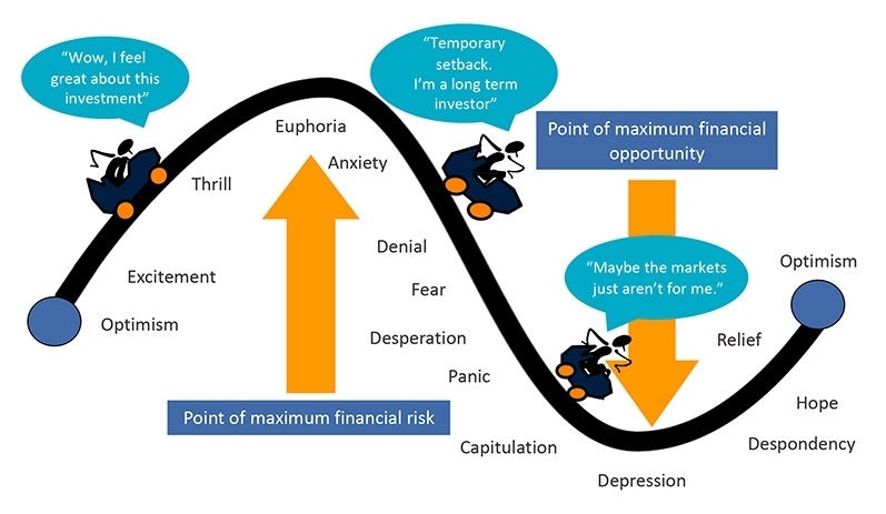
Source: Russell Investments, AMP
Key message: investor emotion plays a huge role in magnifying the swings in investment markets. The key for investors is not to get sucked into this emotional roller coaster. Of course, doing this is easier said than done, which is why many investors end up getting wrong footed by the investment cycle.
Chart #4 The wall of worry
There is always something for investors to worry about it seems. And in a world where social media is competing intensely with old media it all seems more magnified and worrying. This is arguably evident again now in relation to uncertainty about inflation, interest rates and associated recessions risks. The global economy has had plenty of worries over the last century, but it got over them with Australian shares returning 11.7% per annum since 1900, with a broad rising trend in the All Ords price index as can be seen in the next chart, and US shares returning 9.9% pa. (Note that this chart shows the All Ords share price index whereas the first chart shows the value of $1 invested in the All Ords accumulation index, which allows for changes in share prices and dividends.)
Key message: worries are normal around the economy and investments and sometimes they become intense – like now. But they eventually pass.
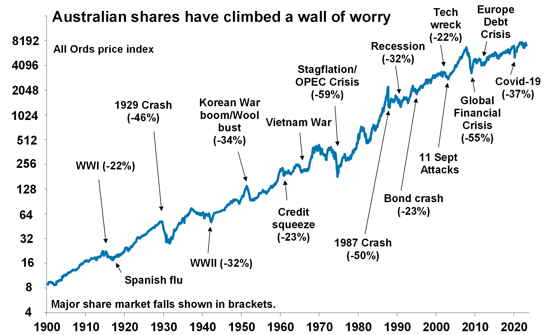
Source: ASX, AMP
Chart #5 Timing is hard
The temptation to time markets is immense. With the benefit of hindsight many swings in markets like the tech boom and bust and the GFC look inevitable and hence forecastable and so it’s natural to think why not switch between say cash and shares within your super fund to anticipate market moves. This is particularly the case in times of emotional stress like now when much of the news around inflation, interest rates and recession risks seem bad. Fair enough if you have a process and put the effort in. But without a tried and tested market timing process, trying to time the market is difficult. A good way to demonstrate this is with a comparison of returns if an investor is fully invested in shares versus missing out on the best (or worst) days. The next chart shows that if you were fully invested in Australian shares from January 1995, you would have returned 9.3% pa (with dividends but not allowing for franking credits, tax and fees).
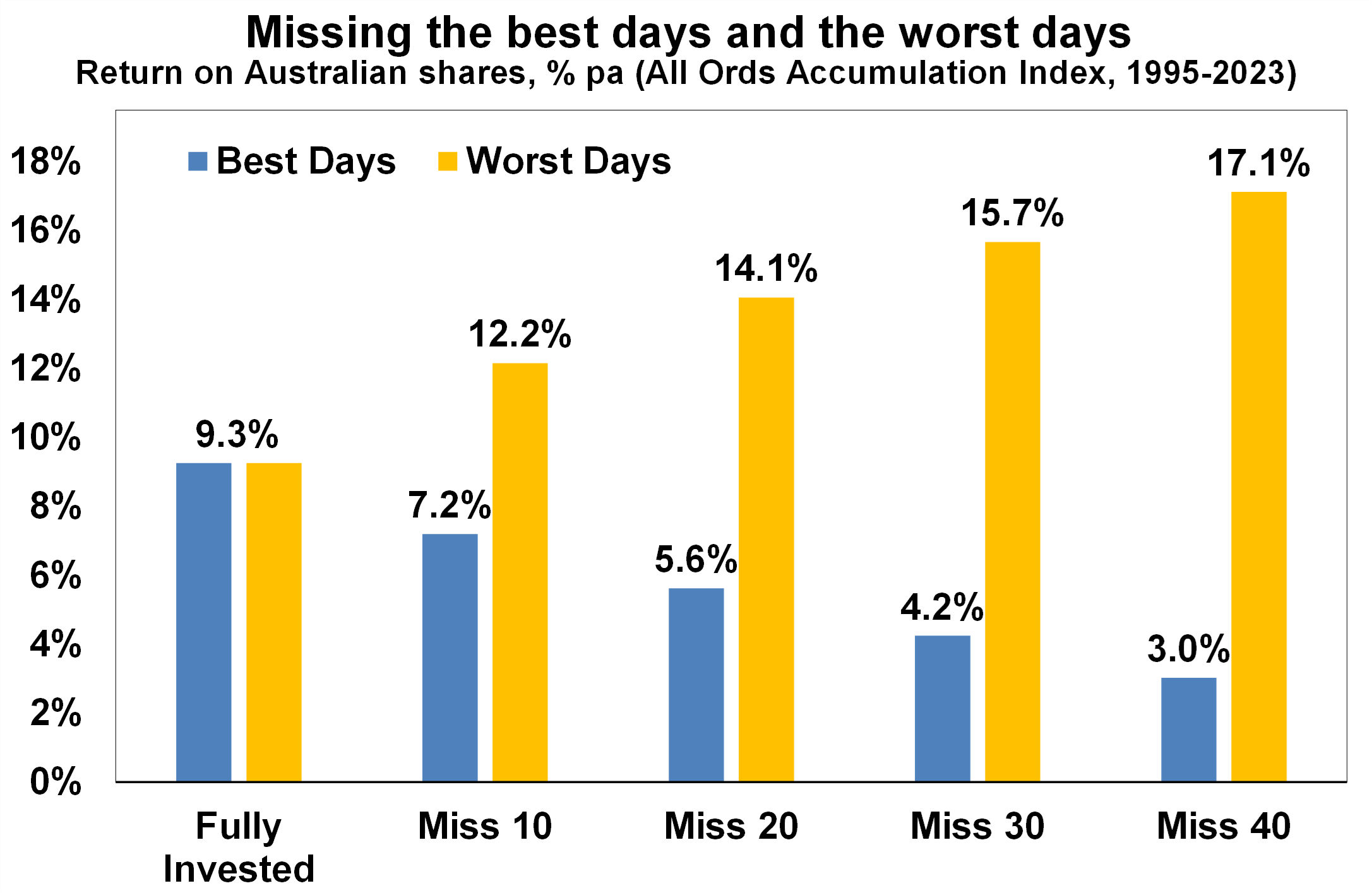
Covers Jan 1995 to 17 March 2020. Source: Bloomberg, AMP
If by trying to time the market you avoided the 10 worst days (yellow bars), you would have boosted your return to 12.2% pa. And if you avoided the 40 worst days, it would have been boosted to 17.1% pa! But this is very hard, and many investors only get out after the bad returns have occurred, just in time to miss some of the best days. For example, if by trying to time the market you miss the 10 best days (blue bars), the return falls to 7.2% pa. If you miss the 40 best days, it drops to just 3% pa.
Key message: trying to time the share market is not easy. For most its best to stick to an appropriate well thought out long term investment strategy.
What you need to know
While every care has been taken in the preparation of this article, neither National Mutual Funds Management Ltd (ABN 32 006 787 720, AFSL 234652) (NMFM), AMP Limited ABN 49 079 354 519 nor any other member of the AMP Group (AMP) makes any representations or warranties as to the accuracy or completeness of any statement in it including, without limitation, any forecasts. Past performance is not a reliable indicator of future performance. This document has been prepared for the purpose of providing general information, without taking account of any particular investor’s objectives, financial situation or needs. An investor should, before making any investment decisions, consider the appropriateness of the information in this document, and seek professional advice, having regard to the investor’s objectives, financial situation and needs. This article is solely for the use of the party to whom it is provided and must not be provided to any other person or entity without the express written consent AMP. This article is not intended for distribution or use in any jurisdiction where it would be contrary to applicable laws, regulations or directives and does not constitute a recommendation, offer, solicitation or invitation to invest.
The information on this page was current on the date the page was published. For up-to-date information, we refer you to the relevant product disclosure statement, target market determination and product updates available at amp.com.au.